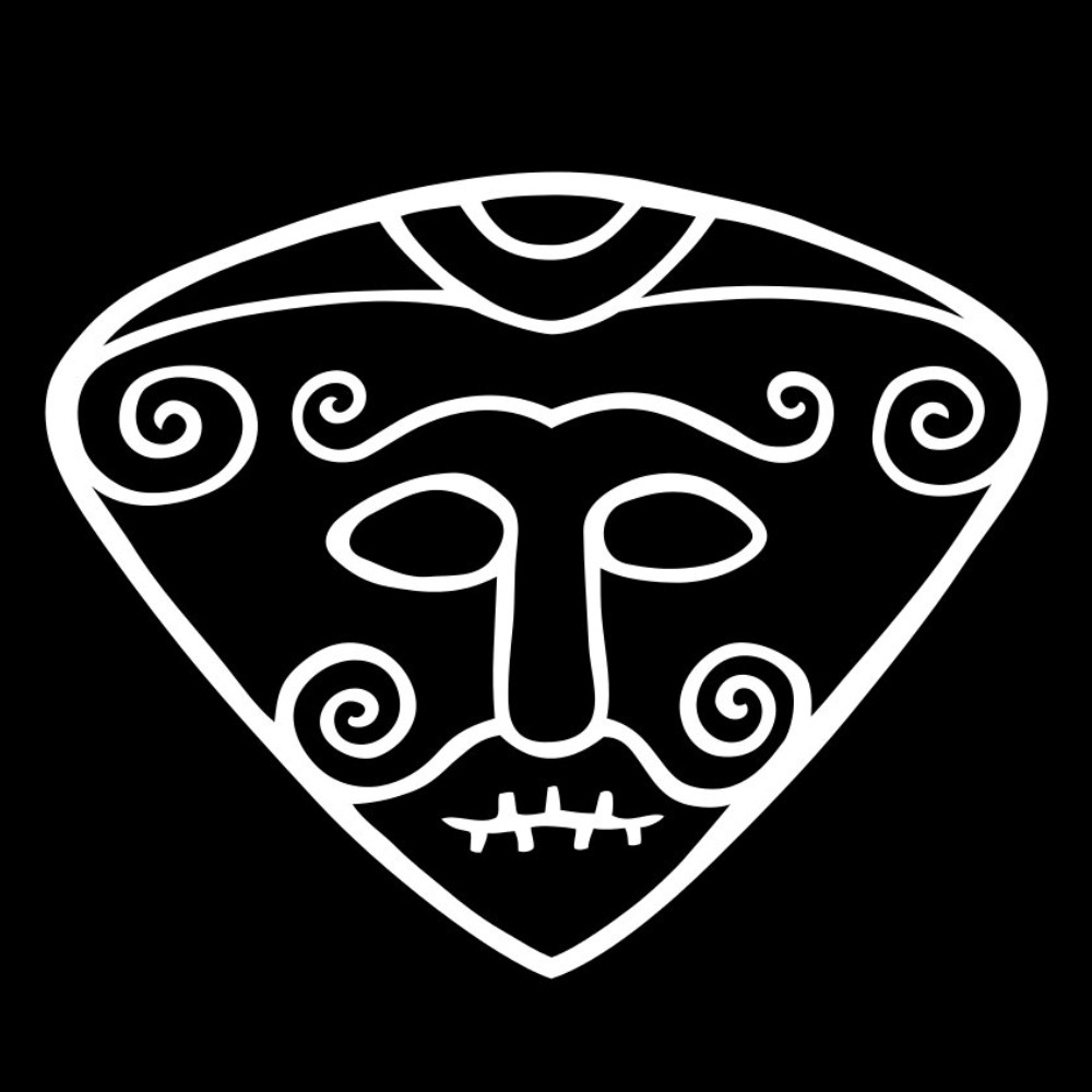
Can we use the actual fediverse symbol instead of that asterism?
issue raised on the wp_activitypub github:
What the title says.
Or just don’t drop symbols inline. That wishy-washy asterism BS is such a pearl clutching gentrification of the witchy, nonconformist roots of the fediverse.
Fuck yeah rainbow pentagrams 🤘
If you want to be taken seriously you should re-word your issue and the title.
Be explicit about:
- what icon you prefer,
- include a graphical example
- include examples where it’s used to back up your claim that it’s the "actual fediverse symbol "
- highlight the issues with the current icon,
- include an example of the icon you disagree with.
The issue you’ve linked is literally just a complaint with zero context.
If you want to be taken seriously, or at least get a constructive reply — don’t open with “If you want to be taken seriously”. It reads really condescending, and I’m going to have to assume that’s your intention.
So here goes:
Assume that even if you don’t immediately understand the context, one probably exists outside your frame of reference. If the post catches your interest, look up that context. Otherwise, move along.
Don’t expect other users on a discussion board to take you to by the hand and explain the circumstances leading up to this point in history. If you do, please don’t act like you’re the keeper of the style guide (see preamble).
For full clarity, I did not post this for you as a bumper introduction to the backs and forths of the Fediverse symbol feuds, but to signal for those already in the know that the frontline is shifting.
TL;DR — this wasn’t for you, don’t demand that it be customised to your measures.
From what I can see a wordpress plugin uses an icon you disagree with. You’d rather they use something else. Rather than approach them constructively you post your emotional response as an issue on their repo? What response are you expecting from the maintainers?
feud
frontline is shifting
Why all the militaristic language?
all the militaristic language
All of those two examples you cherrypicked?
You have demonstrated your reading retention abilities already, just jog on as suggested 🤝
@haverholm@kbin.earth I don’t know much about this plugin, but I do know it was “aquired” by Automattic… basically meaning that the developer was hired to work for Automattic. I don’t watch every episode of As WP Turns, but in the last episode of that drama I watched I think Matt announced that Automattic was scaling back their contributions to the open source aspects of WP… which would include this plugin.
If you want to see this change, you will likely need to make the request in the form of a PR. If you don’t have the knowledge and skills required to do that (and aren’t willing to invest the time it take to gain that knowledge and skill), I suggest you start being more professional and polite when making requests for the changes you want.
You’ve paid nothing for this code. Have some empathy for the maintainer.
Now, if we could get the Unicode Consortium to add the graphical logo, I’d be sold. But if we must pick an existing character, I for one prefer the outlined star (⚝) much more than either the asterism (⁂) or the pentagram (⛧).
Unlike the pentagram, it aligns a lot better with inline text and looks nice and smooth. It’s also far less commonly used or overloaded with existing readings.
The asterism would be easier to unambiguously read or write by hand though! That’s its one pro.
I love ⚝! Wasn’t aware of its existence. It looks more like the full-scale Fediverse logo than ⛦, and also looks a lot friendlier. Big fan.
A star also makes sense in that one of the functions on a lot of federated platforms is to favourite posts, indicated by ☆. So using a star as a symbol for social media makes some degree of intuitive sense, perhaps. In addition to the similarity to the rainbow pentagram, obviously.
See, there’s a typographic argument I can get behind. Having worked as a magazine layouter and kerning pincher, horizontal alignment is a very valid point.
As for handwriting, that’s barely an issue since we’re talking online text, but let’s go: Is an asterism easier to write by hand? Not really, you have to squeeze in three asterisks in the height of one line. They’ll likely render as blobs. Could you draw a star easier and faster? I think so.
Stars are perhaps even more common in written text for highlights and annotations than typed text, at least around here. I can draw a star much faster than three asterisks. But it wouldn’t be very easily distinguishable as the Fediverse star. And that’s the same between the regular sharp and pointy star and the rounded outline one.

Hell to the yes. 🔥
How can we get the fediverse pentagram into nerd fonts? They have the mastodon icon
There’s an icon request on Font Awesome’s github, go give it a vote/thumbs up! 🙂
(edit: first posted link was a duplicate request, it has been changed to the recommended one)
Would it help if we got together a zipped file of the various Fediverse logos as SVGs and linked it in over there? The less work they have to do the more likely it would be to get adopted.
What’s the asterism?
It’s a typographical symbol consisting of three asterisks ⁂ — it has literally and visually nothing to do with the fediverse, except some fickle worrywarts campaigned for it to replace the rainbow pentagram a while back.
And it needs to get in the sea.
Oh the Predator target marker!
Oh, was this because of the association of pentagrams with Satanism?
no, because “its design is a little too complex to be used at small sizes, as you would in text or in a button. It’s also only available in image form, not as a typographical character.”
I like the idea of using a symbol but its ugly sadly
Yeah, but the asterism is hardly readable at small sizes either. The solution would be to have the rainbowgram included in Unicode standards, but clearly somebody preferred a triangle of anuses over a widely adopted existing symbol 🙄
I can see how a unicode symbol could be nice - the asterism is just convenient. It’s nice enough, and it fits the metaphor. The pentagram is good for other uses.
I personally prefer ⛧ as the Unicode symbol, but I can kinda see why it hasn’t taken off.
it fits the metaphor
Does it though? If the stars are nodes, how are you going to illustrate a (federated) network with less than four points? The pentagram does that more clearly.
Just riffing off your username — sorry if that’s uncalled for — isn’t there a good Runic character that fits the same purpose? AFAIK those have a Unicode subset?
I guess there are multiple metaphors possible, but I think it works to think of the fediverse as a constellation of multiple stars, each with their own set of celestial objects spinning around them. The pentagram kinda exaggerates how interconnected the fediverse is - sometimes instances will not be interconnected, by design.
As for my username (as well as my profile picture!), I am Scandinavian and pretty tired of nazis stealing my cultural heritage for their bullshit propaganda, so I figured if I’m gonna be an anonymous antifascist online I might as well reclaim some of my culture in the process.
Sadly that’s not quite enough to remove the association between runes and nazism. ᛟ (family/bloodline) has been completely overtaken by nazis, but I think there’s a risk using any set of runes as a symbol would attract the wrong audiences.
In either case I don’t think any of the symbols would have been well suited. They reflect priorities in Nordic society back then - like bull (ᛏ), moose (ᛉ), and horse (ᛖ). ᚷ can represent a gift, but that too has sadly been appropriated by other people we do not like to associate ourselves with.
I guess ᚹ (joy) and ᚱ (travel) would not be so bad, but they don’t immediately strike me as great symbols for a social media protocol either. Maybe they could be fused with the <> ActivityPub logo to some interesting effect.
TFW to skandinaver sidder og skriver engelsk med hinanden online. Dansker bosat i Sverige her 🤝
But to continue in the lingua franca, yes — Runes are unfortunately appropriated by Nazis. I asked without thinking about that connotation, because I generally try not to give those troglodytes too much thought.
On the other hand, are we absolutely sure there isn’t some kind of occult baggage to the asterism as well? I’m fairly certain Aleister Crowley used one constellation of asterisks or other in his writings… Just putting it out here in case the potentially satanic implications of a pentagram logo really did motivate the asterism campaign 😄
Nordmann bosatt i Danmark! 🤝
Speaking of occult meanings, in meteorology, an asterism in a station model indicates moderate snowfall. It all points back to Scandinavia!


